Blue in Harmony: Crafting Color Schemes That Speak Volumes
Welcome back to my vibrant exploration of colour theory! In our previous posts, we unraveled the passionate depths of red, the playful charm of pink, the energetic flair of orange, the sunny optimism of yellow, and the refreshing calm of green. Today, we turn our focus to blue—a colour celebrated not only for its soothing qualities but also for its versatility in design.
Blue is more than just a singular shade; it's the dynamic team player that can transform a palette. Whether you're assembling a harmonious scheme that flows seamlessly, daring to experiment with a triadic palette that delivers balanced contrast, or exploring the subtle sophistication of a monochromatic arrangement, blue stands at the heart of the creative process. In this post, we'll delve into how blue interacts with its companions, setting the mood, creating depth, and adding a splash of intrigue to every composition.
So, if you've ever wondered how to use blue to elevate your designs or balance your colour compositions, read on. Let's unlock the secrets behind blue's collaborative power and see how it transforms ordinary schemes into visually compelling masterpieces.
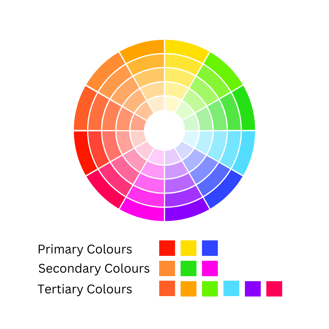
Primary colours—red, yellow, and blue—are the foundational hues that cannot be created by mixing other colours. Secondary colours are formed by combining equal parts of two primary colours, while tertiary colours result from mixing a primary colour with a neighbouring secondary colour, such as red with orange.
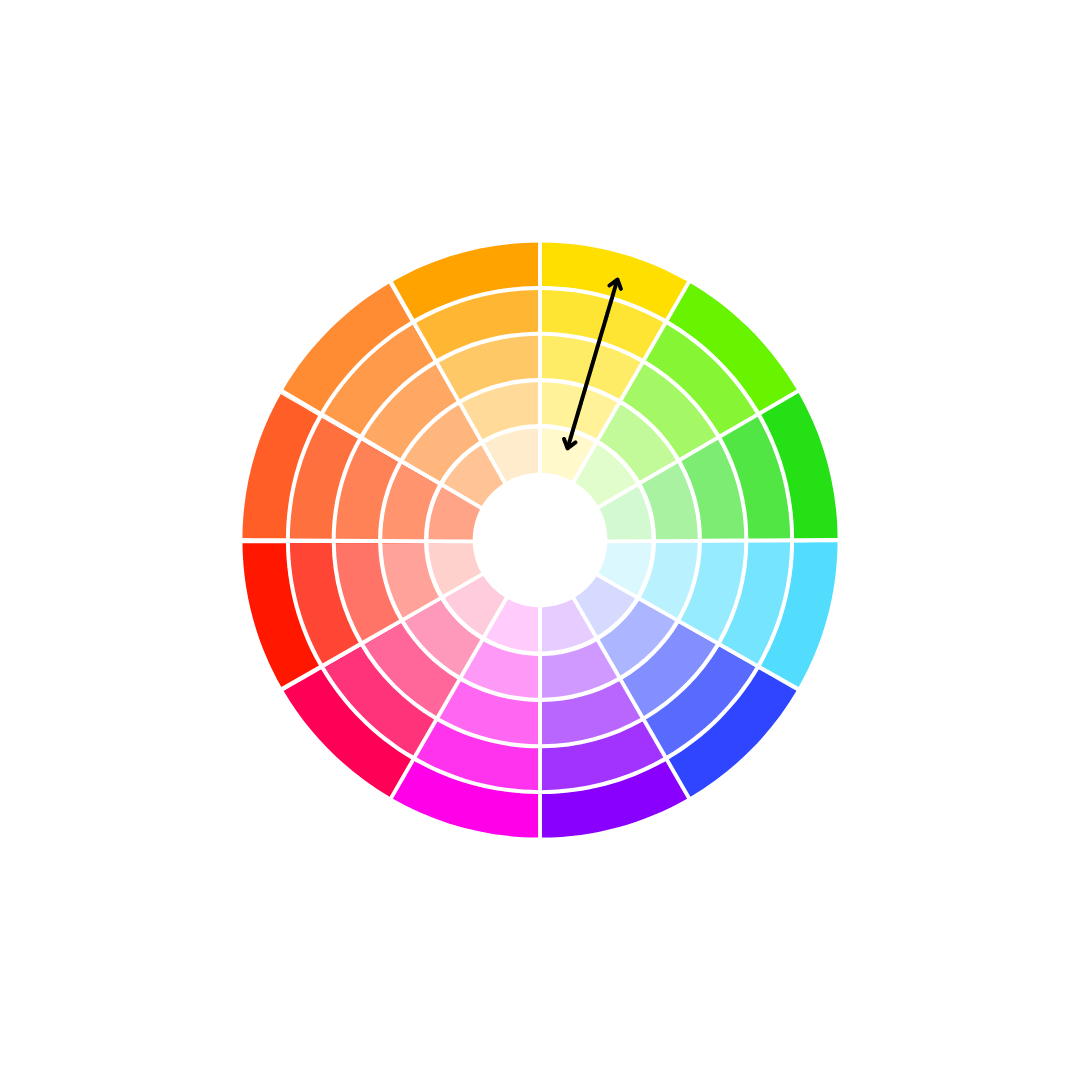
In colour theory, the term hue refers to the basic colour families, such as red, green, or blue—essentially the colours of the rainbow. It’s important to note that black, white, grey, and brown are not considered hues. Value describes the lightness or darkness of a colour, measured on a scale from 0 to 10, with 0 representing black and 10 representing pure white. Chroma, meanwhile, refers to a colour’s intensity or saturation—its vividness or dullness.
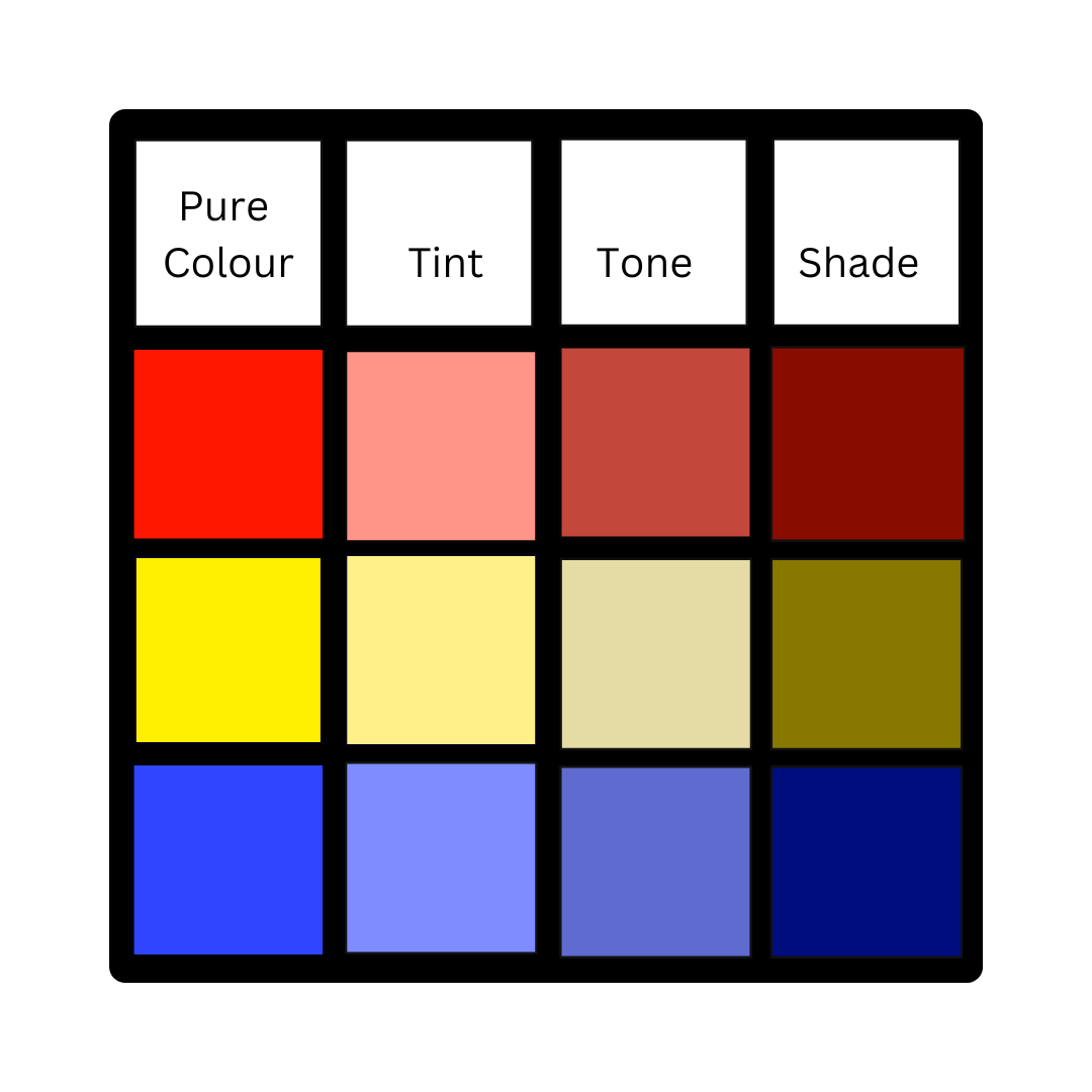
When we talk about shades, tints, and tones, we’re discussing variations of pure colour. A shade is created by mixing a pure colour with black, a tint is made by adding white, and a tone results from blending a colour with grey.
Temperature is another concept in colour theory, often encountered in discussions about personal colour analysis or seasonal palettes. Colour temperature refers to whether a colour has a warm undertone (yellow) or a cool undertone (blue). This distinction plays a crucial role in determining which colours suit certain complexions or settings.
One of the most valuable aspects of colour theory is the idea of colour harmony, which refers to the combinations of colours that produce aesthetically pleasing results. Common colour harmonies include:
Monochromatic
A single colour in various shades, tints, or tones.
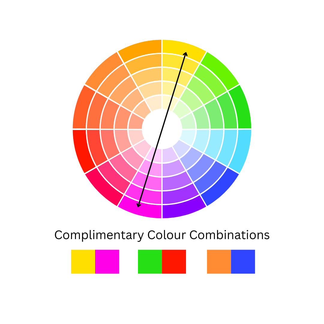
Complementary
Colours that are directly opposite each other on the colour wheel, such as red and green, blue and orange, or yellow and purple.
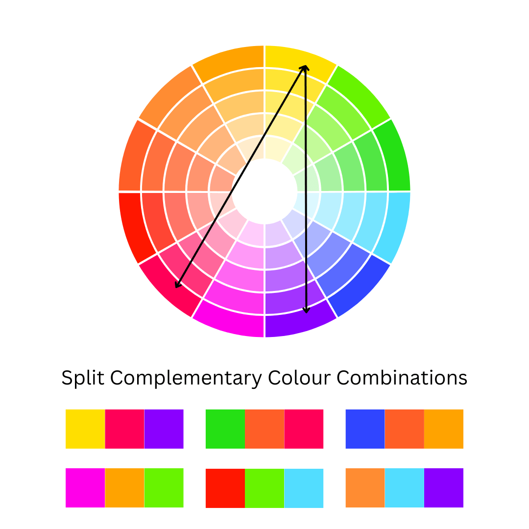
Split Complementary
A key colour paired with two complementary colours on either side of its direct opposite on the colour wheel. For example, with yellow as the key colour, the complementary colours would be red-purple and blue-purple.
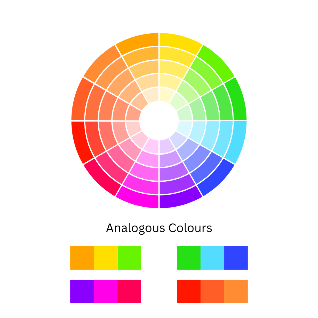
Analogous
A group of three colours that sit next to each other on the colour wheel, such as green-blue, blue, and blue-purple.
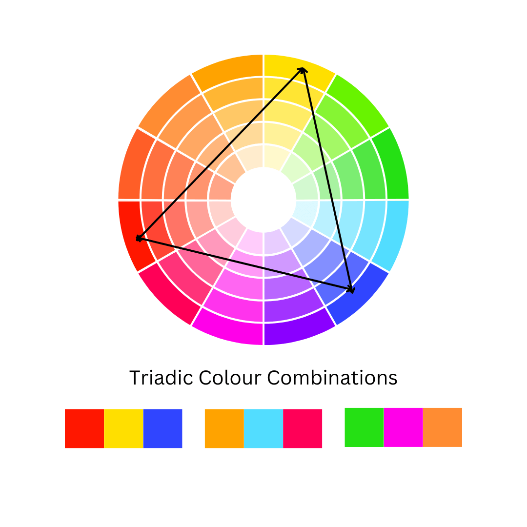
Triadic
A trio of colours evenly spaced around the colour wheel, like red, yellow, and blue.
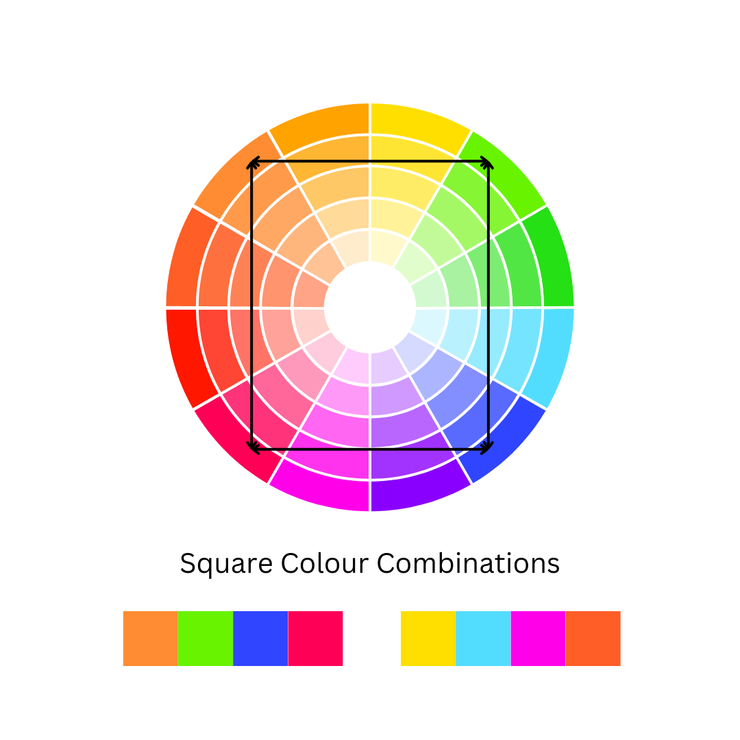
Square
Four colours that are evenly spaced apart on the colour wheel, forming a square when connected.
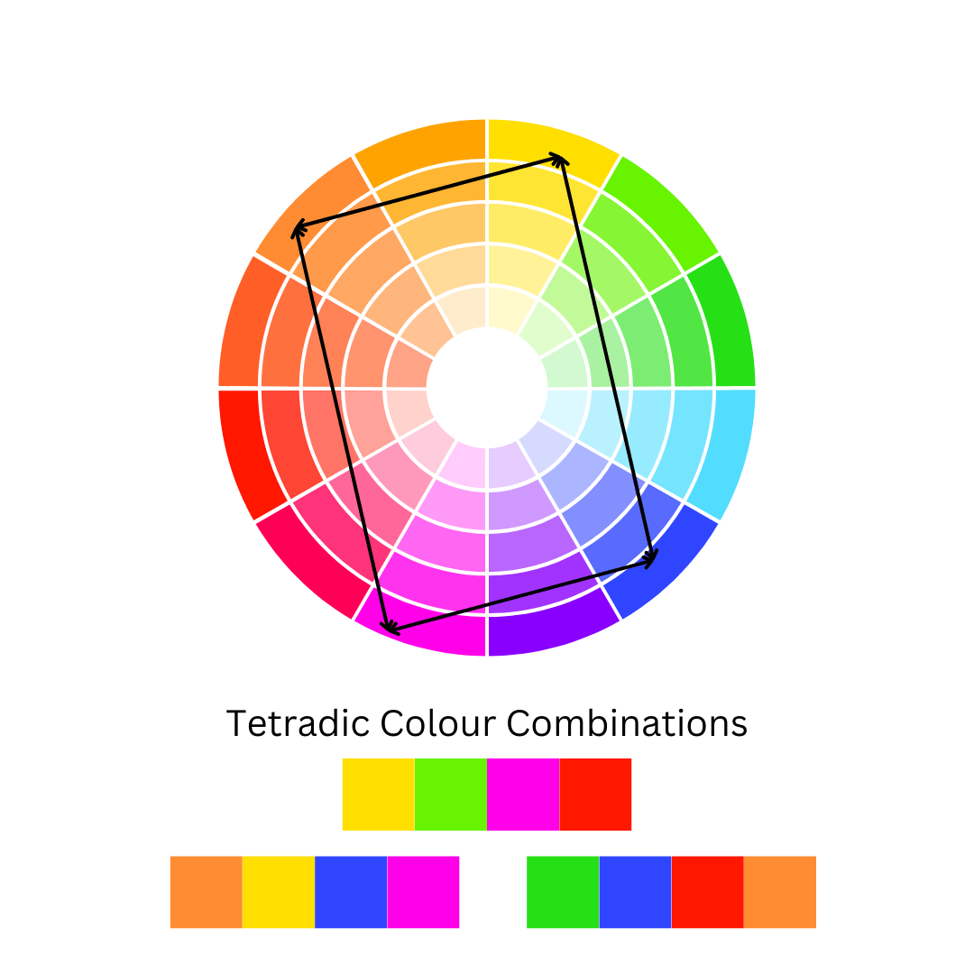
Tetradic
A colour scheme involving four colours that, when connected on the colour wheel, form a rectangle.
Colour theory is the foundation of great design, helping us understand how different hues interact, evoke emotions, and create visual balance. Whether you're working with complementary contrasts, analogous harmonies, or bold triadic palettes, each colour plays a unique role in shaping the overall aesthetic. Among them, blue stands out as one of the most versatile and widely used colours. Known for its calming presence and strong associations with stability and trust, blue effortlessly adapts to various colour schemes—sometimes acting as a grounding force, other times as a striking focal point. But how exactly does blue interact with other colours to create these dynamic effects? Let’s explore how blue works within different palettes and how you can use it to craft stunning, well-balanced designs.

Monochromatic Schemes
A monochromatic colour scheme built around blue creates a sense of depth, cohesion, and tranquillity. By using variations in tone, tint, and shade—from the palest sky blue to deep navy—you can craft a visually harmonious design that feels both elegant and soothing.

Complementary Colour Schemes
A complementary colour scheme featuring blue creates a bold and dynamic contrast by pairing it with its opposite on the colour wheel—orange. This combination balances the cool, calming nature of blue with the warmth and energy of orange, resulting in a visually striking effect.

Split Complementary Colour Schemes
A split complementary colour scheme using blue offers a balanced contrast with a slightly softer effect than a true complementary scheme. Instead of pairing blue directly with orange, this approach combines blue with the two colours adjacent to orange—red-orange and yellow-orange.

Analogous Colour Schemes
An analogous colour scheme featuring blue creates a naturally harmonious and visually soothing effect by pairing it with colours that sit next to it on the color wheel—blue-green and blue-violet. This combination enhances blue’s calming qualities while introducing subtle variety and depth.

Triadic Colour Scheme
A triadic colour scheme featuring blue creates a lively and balanced composition by combining it with two other colours evenly spaced on the colour wheel—red and yellow. This trio forms a vibrant yet harmonious palette, as the warm energy of red and yellow contrasts beautifully with blue’s cool, calming presence
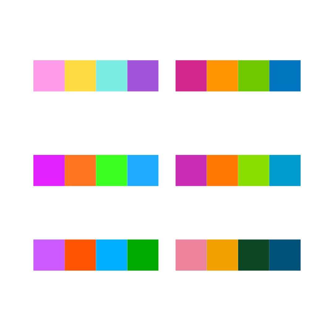
Square Colour Scheme
A square colour scheme featuring blue creates a bold and diverse palette by using four colours evenly spaced around the colour wheel—blue, red-orange, yellow, and green. This combination balances warm and cool tones, offering strong contrast while maintaining harmony.
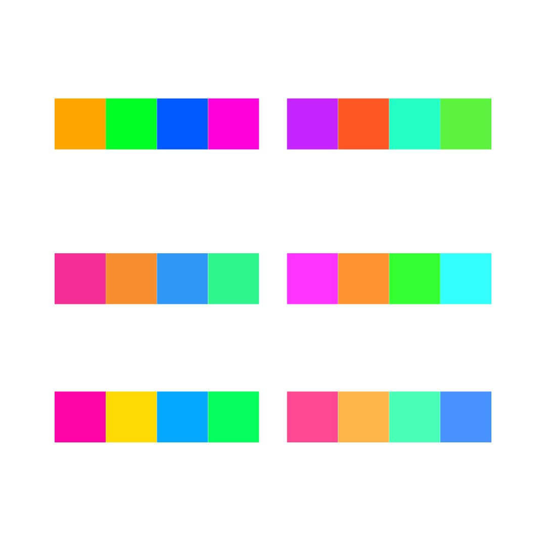
Tetradic Colour Schemes
A tetradic colour scheme featuring blue is a rich and dynamic palette that uses four colours arranged in two complementary pairs—blue, orange, yellow-green, and red-violet. This scheme offers both contrast and variety, combining blue’s cool stability with the warmth of orange, the freshness of yellow-green, and the vibrancy of red-violet.
The Emotional Impact of Wearing Blue
Wearing blue can evoke a sense of calm, confidence, and reliability. As a colour often associated with trust, intelligence, and stability, blue is a popular choice for professional settings, helping to convey authority without feeling overpowering. Lighter shades, like sky blue, can create a soft, approachable, and peaceful impression, while deeper tones, like navy, exude sophistication and strength. Blue is also linked to introspection and serenity, making it a go-to colour for those seeking a composed and balanced presence in both personal and professional environments.
Blue Colour Schemes on the Streets
-

Monochromatic
-

-

-

Complimentary
-

-

-

Analogous
-

-

-

Triadic
-

-

Bringing Colour Theory to Life
Blue is a powerful and versatile colour, effortlessly adapting to a range of colour schemes—from the seamless elegance of monochromatic palettes to the bold contrasts of complementary and triadic combinations. Whether used for its calming and trustworthy nature or its ability to create dynamic visual impact, blue plays a crucial role in design, fashion, and branding. It harmonizes beautifully with analogous hues, balances vibrant square and tetradic schemes, and brings depth and contrast in split complementary pairings.
Now that you’ve explored the many ways blue interacts with other colours, how will you incorporate it into your next design, outfit, or creative project? Share your thoughts in the comments below or experiment with blue in your own color schemes!

About the Author
Melissa Rath is an Australian milliner creating unique, handcrafted hats. She shares insights on design, styling, colour theory, the history of hats and all things millinery.
Featured collection
-
Yellow Millinery Fascinator by Melissa Rath Millinery
Regular price $220.00 AUDRegular priceUnit price / per -
Rainbow Veiled Headband with Pleather Flowers by Melissa Rath Millinery
Regular price $250.00 AUDRegular priceUnit price / per -
Purple Organza Millinery Fascinator by Melissa Rath Millinery
Regular price $220.00 AUDRegular priceUnit price / per -
Purple Millinery Boater Hat by Melissa Rath Millinery
Regular price $320.00 AUDRegular priceUnit price / per


