Colour is more than just a collection of hues—it's about creating harmony, contrast, and emotion through combinations. Just as each colour has its own personality, the way colours work together can evoke powerful responses and tell a deeper story.
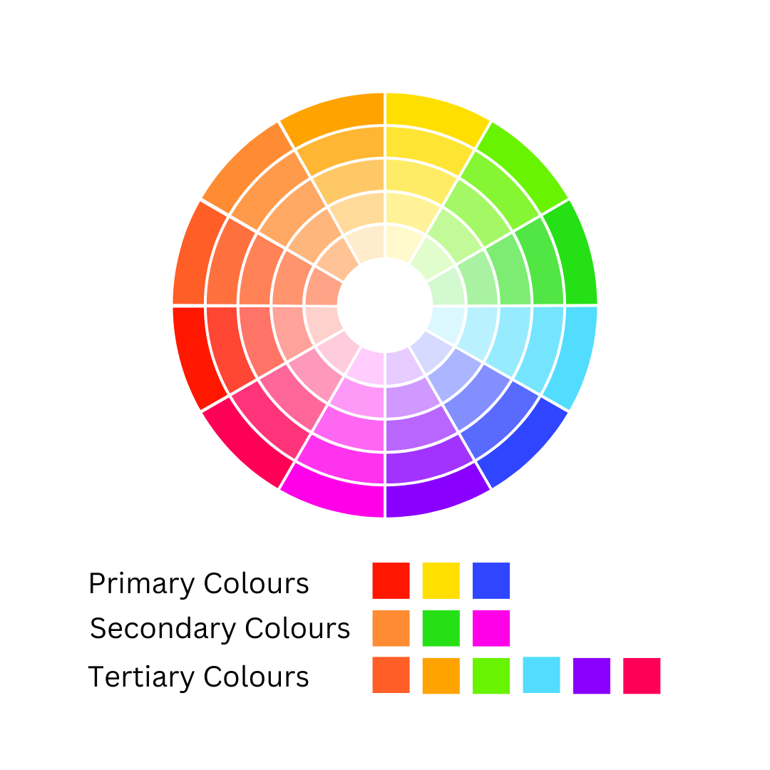
Primary colours—red, yellow, and blue—are the foundational hues that cannot be created by mixing other colours. Secondary colours are formed by combining equal parts of two primary colours, while tertiary colours result from mixing a primary colour with a neighbouring secondary colour, such as red with orange.
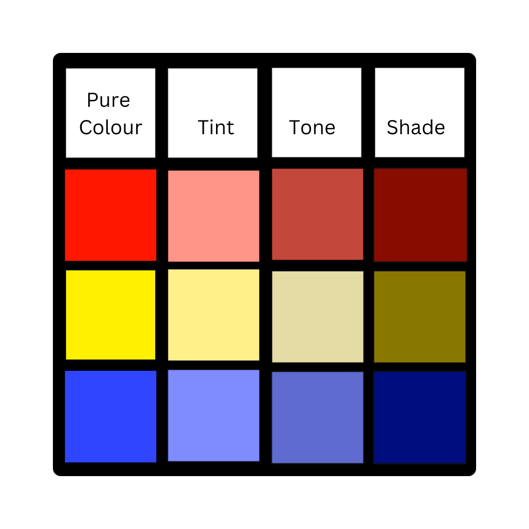
When we talk about shades, tints, and tones, we’re discussing variations of pure colour. A shade is created by mixing a pure colour with black, a tint is made by adding white, and a tone results from blending a colour with grey.
Monochromatic
A single colour in various shades, tints, or tones.
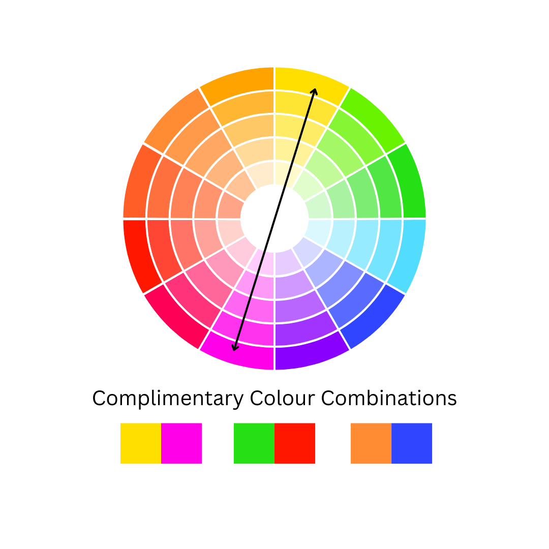
Complementary
Colours that are directly opposite each other on the colour wheel, such as red and green, blue and orange, or yellow and purple.
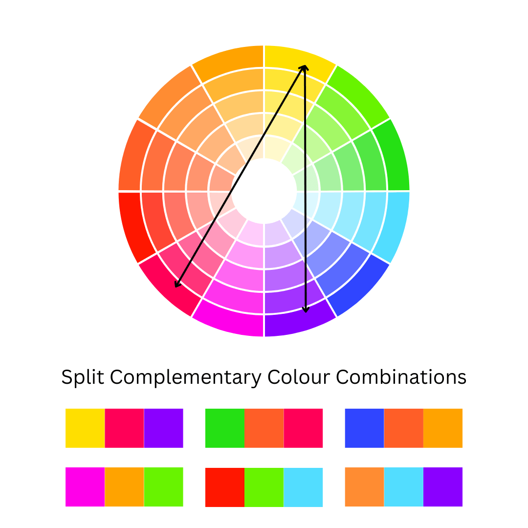
Split Complementary
A key colour paired with two complementary colours on either side of its direct opposite on the colour wheel. For example, with yellow as the key colour, the complementary colours would be red-purple and blue-purple.
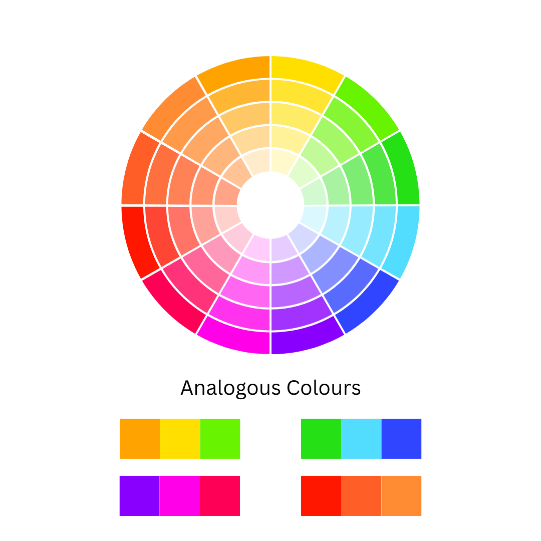
Analogous
A group of three colours that sit next to each other on the colour wheel, such as green-blue, blue, and blue-purple.
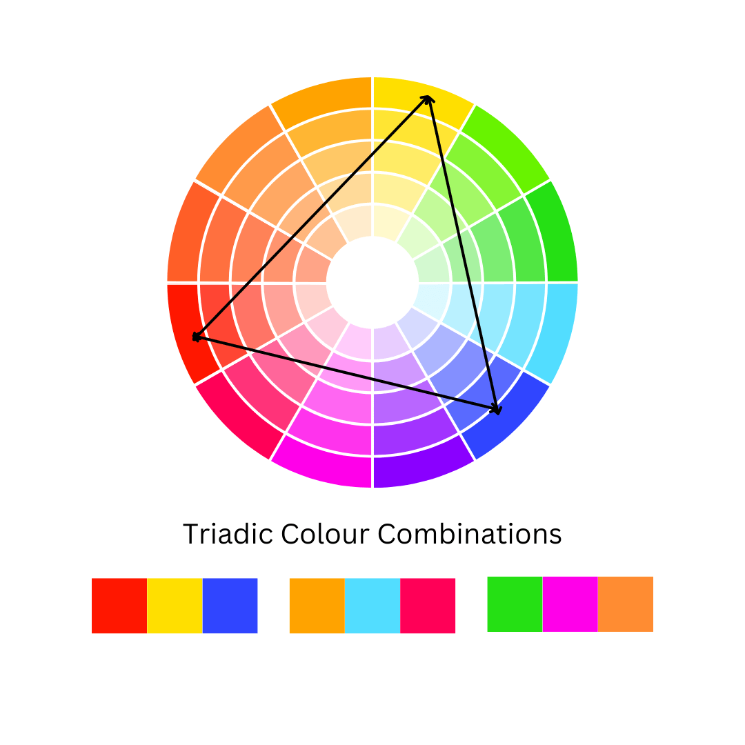
Triadic
A trio of colours evenly spaced around the colour wheel, like red, yellow, and blue.
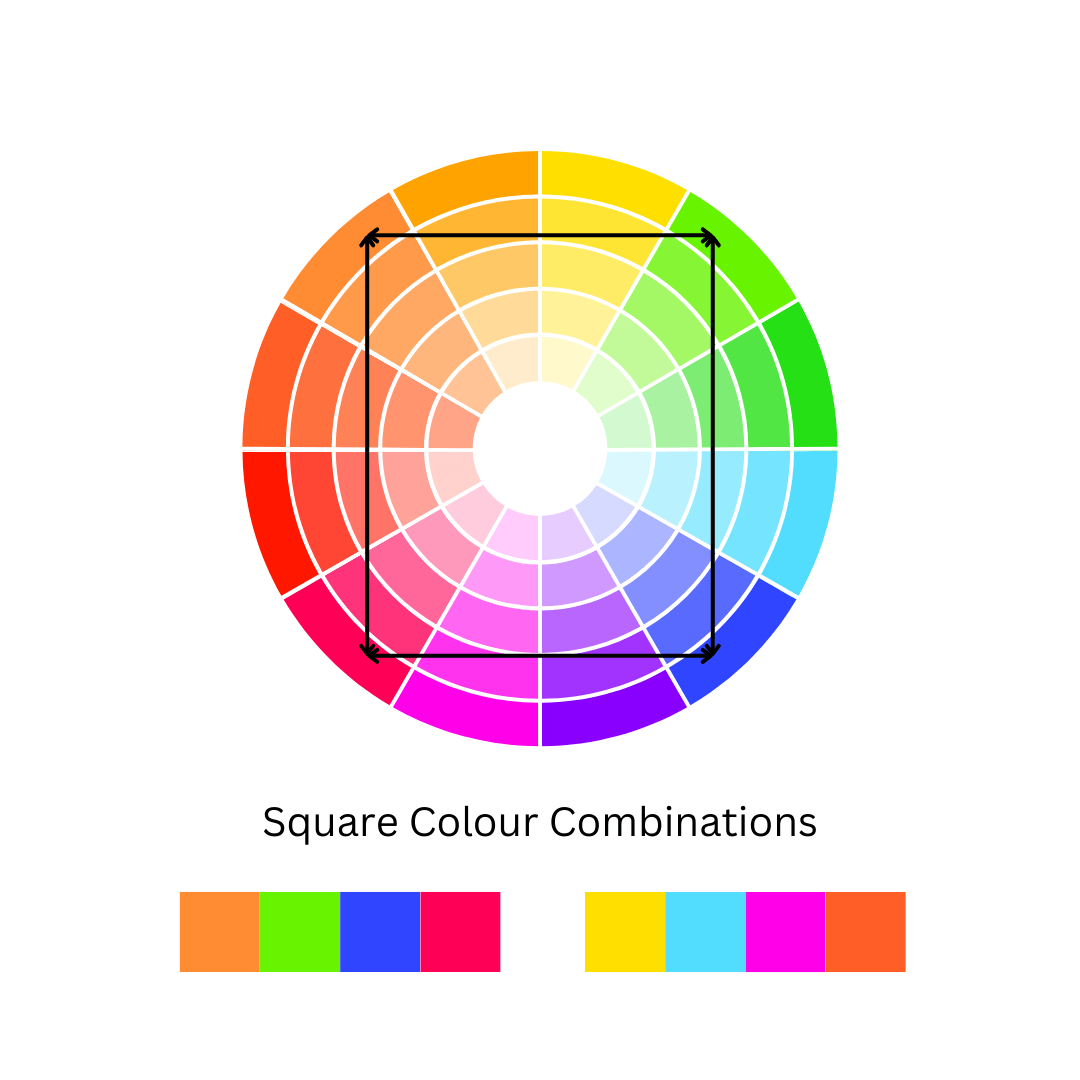
Square
Four colours that are evenly spaced apart on the colour wheel, forming a square when connected.
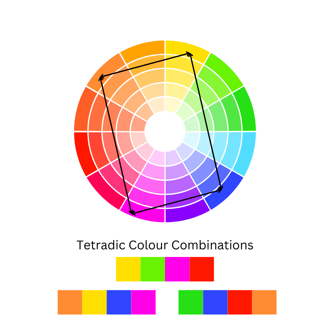
Tetradic
A colour scheme involving four colours that, when connected on the colour wheel, form a rectangle.

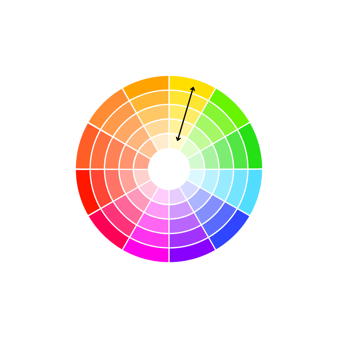
Monochromatic Schemes
When applying a monochromatic colour scheme concept to yellow, the result is a dynamic and versatile palette that can evoke a range of emotions and atmospheres. Lighter tints of yellow create soft, calming pastels, while, darker shades of yellow result in rich, golden tone.

Complementary Colour Schemes
This pairing naturally draws the eye, making it ideal for creating bold, attention-grabbing designs.
A bright, saturated yellow paired with a deep, rich purple produces a dramatic, energetic contrast. Softer shades , however, create a more subdued and elegant aesthetic.

Split Complementary Colour Schemes
This trio balances yellow’s brightness with the cooler, deeper tones of blue-violet and the warmth of red-violet. The result is a visually dynamic yet harmonious palette. Designers and artists often use this scheme

Analogous Colour Schemes
This combination reflects the natural progression of colours found in nature, evoking feelings of warmth, energy, and freshness.Using an analogous scheme with yellow allows for smooth transitions between hues while maintaining a unified look.

Triadic Colour Scheme
This combination creates a vibrant and visually striking effect due to the strong contrast among the three hues while maintaining a sense of balance.
When used together, these colours create a sense of harmony with built-in contrast.

Square Colour Scheme
The square colour scheme provides variety and versatility while maintaining a sense of balance. Yellow serves as a bright, energetic anchor, while the other colours—blue, red, and green—add depth, richness, and diversity.

Tetradic Colour Schemes
For yellow, the tetradic colours scheme creates a rich, diverse palette with a high level of contrast, offering both variety and balance. Yellow serves as a bright, vibrant focal point, while purple adds depth. Blue brings a sense of calm and balance, while orange introduces warmth and energy.
The Emotional Impact of Wearing Yellow
Yellow Colour Schemes on the Streets
-

Monochromatic
-

-

-

Complimentary
-

-

-

Analogous
-

-

-

Triadic
-

-


Bringing Colour Theory to Life

About the Author
Melissa Rath is an Australian milliner creating unique, handcrafted hats. She shares insights on design, styling, colour theory, the history of hats and all things millinery.


Featured collection
-
Yellow Beaded Halo Headband by Melissa Rath Millinery
Regular price $125.00 AUDRegular priceUnit price per -
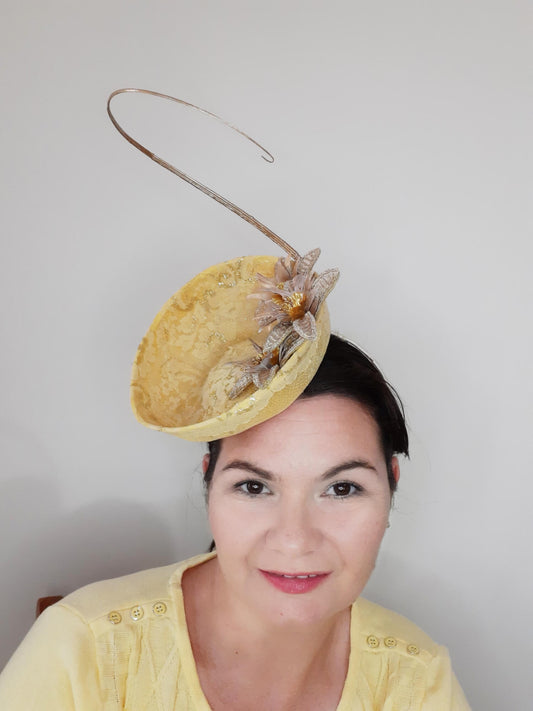
Yellow Millinery Saucer Hat by Melissa Rath Millinery
Regular price $250.00 AUDRegular priceUnit price per -
Yellow Millinery Fascinator by Melissa Rath Millinery
Regular price $220.00 AUDRegular priceUnit price per -
Yellow Floral Headband with Veil by Melissa Rath Millinery
Regular price $125.00 AUDRegular priceUnit price per